Chapter 20
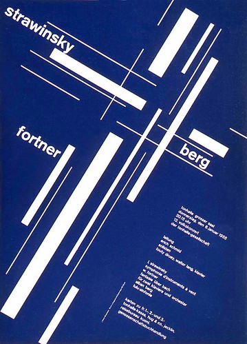
-Developed in Switzerland in the 1950's. It's emphasizes cleanliness, readability and objectivity. It has an asymmetrical layout, a grid, sans-serif typefaces. The grid was of horizontal and vertical lines used to align the elements in their designs. Preferred photography.
2. One image I find interesting. (website found at bottom first one)
3. Where did the roots of this movement come from?
-This came after WWII. The designers from Switzerland and Germany created the Swiss or International Typographic Style. They wanted a neutral and objective approach that emphasized rational expression.
Chapter 22
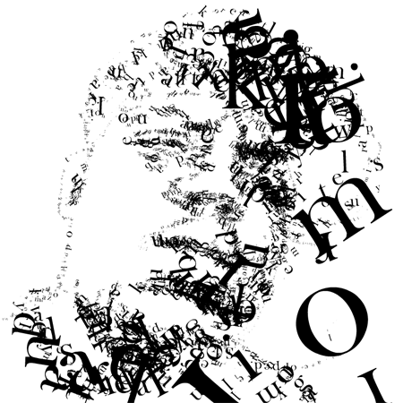
4. One image I find to be successful corporate identity system.


Chapter 23 (start on page 402)
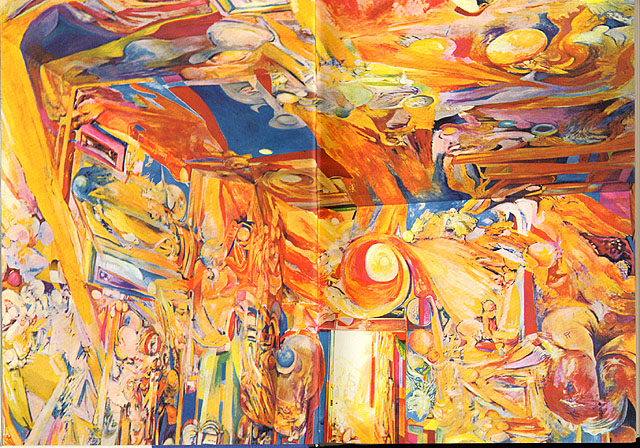
5. Define psychedelic poster and place one image that you find to be an interesting example of it.
-This was introduced by drugs such as LSD, Mescaline, and Psilocybin. The word "psychedelic" means "mind manifesting" in British. Psychedelic art refers to all the art movement of the 1960's counterculture. These were concert posters, album covers, lightshows, murals, comic books, underground newspapers, and more reflected the Kaleidoscope swirling patterns of LSD hallucinations and the revolutionary political, social, and spiritual sentiments from the psychedelic states of consciousness.


No comments:
Post a Comment