Monday, February 9, 2009
Tuesday, April 29, 2008
Chapter 20, 22, & 23
Chapter 20
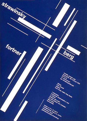
-Developed in Switzerland in the 1950's. It's emphasizes cleanliness, readability and objectivity. It has an asymmetrical layout, a grid, sans-serif typefaces. The grid was of horizontal and vertical lines used to align the elements in their designs. Preferred photography.
2. One image I find interesting. (website found at bottom first one)
3. Where did the roots of this movement come from?
-This came after WWII. The designers from Switzerland and Germany created the Swiss or International Typographic Style. They wanted a neutral and objective approach that emphasized rational expression.
Chapter 22
4. One image I find to be successful corporate identity system.


Chapter 23 (start on page 402)
5. Define psychedelic poster and place one image that you find to be an interesting example of it.
-This was introduced by drugs such as LSD, Mescaline, and Psilocybin. The word "psychedelic" means "mind manifesting" in British. Psychedelic art refers to all the art movement of the 1960's counterculture. These were concert posters, album covers, lightshows, murals, comic books, underground newspapers, and more reflected the Kaleidoscope swirling patterns of LSD hallucinations and the revolutionary political, social, and spiritual sentiments from the psychedelic states of consciousness.


Sunday, April 20, 2008
The Modern Movement in America pages 336-341, 344-350
American Kitsch or 50's art is art that is tacky, vulgar, the movie Grease, old fashioned, blue jeans and t-shirts, poodle skirts, and different hair styles.
Examples from www.google.com


-In 1913 the Armory Show introduced modernism to America. It generated a storm of protest and provoked public rejection of modern art and design. This was also before WWII. So it's the period in between the two World Wars.
2. How was Tschichold's work seen in America?
-His work caused excitement and tumoil. Some recognized its vitality and functionalism of the new ideas. It was the start of new ideas and the boom for advertising that took off. Typographic espressions ranged from Renaissance-inpired designs to books for avant-garde music and dance that helped define the modernist design in America. He wanted strong, direct, and exciting visual forms.
3. What Immigrants came to America?
-Erte Romain de Tirtoff, Dr. Mehemed Fehmy Agha, Alexey Brodovitch, and Alexander Liberman. Erte was a Russian admiral's son and was a designer of art deco. He designed cover for Harper's Bazaar magazine and combined cubism and exotic decorativeness, and the elegance of high fasion. Dr. Agha was the first art director design in guide the graphic design and he introduced the bleed photography, machine-set sans serif type, white space, and asymmetrical layouts. Alexey Brodovitch took over the magazine Harper's Baazar and he was known for white space and sharp type on clear, open pages, musical feeling of approach in flow of text and pictures. Alexander Liberman from Russia, was known for using airbrush to achieve highly finished forms, strong cubist beginnings eventually came to stylized realism.
4. Describe how poster looked in WWII.
-A poster from World War II was neutrality, traditionalism, and provincialism. Also, they were informational training materials and amaterurish cartoons. Intense feelings about Hitler, Pearl Harbor, and the war seemed to pull powerful communications. There was dramatic contrast in color and scale. The point was to boost the moral of the Allied nations. The classical Greek messenger of Gods, combines with an American flag to make a powerful graphic symbol.
5. One example of the Art work from an American artist that I find interesting.
By: Ben Cunningham

Thursday, April 17, 2008
Rest of Bauhaus and New Typography Chapter
1. What did Jan Tschichold hope to accomplish with his book Die Neue Typographie (The New Typography)?
-He hoped to "degenerate typefaces and arrangements". He wanted to start clean and find a new asymmetrical typography to express the spirit, life, and visual sensibility of the day. His objective was functional design by the most straightforward means. Tschichold decleared the aim of every typographic work to be the delivery of a message in the shortest, most efficient manner. In his work he emphasized the nature of machine composition and its impact on the design process and product.
2. What was the importance of Laszlo Moholy-Nagy with photography?
-His compositions were unexpected he used the light and sometimes shadows to design space. His photos were shot from a bird's eye view, worm's eye view, extreme close-up, and angled viewpoints. The importance of his photography was that it was a process of new expression that was more creative and more functional and straightforward. His photoplastics could be humorous, visionary, moving or insightful, and usually had drawn additions, complex associations, and unexpected juxtapositions.
3. What were the importance of the typefaces Times New Roman, Futura and Universal Alphabet.
-Times New Roman was important because it's one of the most commonly used typefaces today. It has short ascenders and descenders and sharp, small serifs. It was introduced October 3, 1932 in the edition of London's newspaper of record. This typeface was very known for being very legible and had good clarity. The stems and curves lightly thicker than in most roman-style letterforms. A touch of robust color associated with Calson type and you got the new typefaces. As for Futura it was designed by Paul Renner for the Bauer foundry in Germany. It had 15 alphabets, including four italics and two unusual display fonts, and became the most widely used geometric sans-serif family. The ideas was for each generation to try and solve problems from previous generation and to attempt to create a contemporary form true to its own time. (As in to make it their own) The Universal Alphabet was from Bayer. It had many geometrically constructed sans-serif typefaces were designed during the 1920's. Basically this paved the way and opened up new ideas to lead us to where we are now with our typefaces.
Tuesday, April 15, 2008
A New Language of Form pages 287-309 and Bauhaus
Modernized sign/poster of today

-One thing I felt that was the most useful was that Hitler used the posters to his advantage to advertise his ideal world which surprisingly worked on most people. It was like people were brainwashed into Hitler's ideas from advertising.
2. What questions remain in your mind after today's discussion about the modern art movements and Plakastil?
-One question I have is that was this the era that made posters the most people that made people believe or buy into ideas or products. So the effect of that advertising then is the reason why we have so much advertising in our world today. Everywhere we look there's practically advertising whether it's from TV, the radio, billboards, cars/trucks, etc.
3. Define Art Deco.
-This style was the modernized style of all the ones from the past. The modern elements included echoing and automobile patterns and shapes such as stylized gears and wheels, or natural elements such as sunbursts and flowers. Architecture, interiors, furnishing, fine arts, handmade crafts, posters,and industrial design. Speed best describes the style of Art Deco. Influenced by Cubism, Futurism, and Constructivism, ancient geometrical design styles from Egypt, Assyria, and Persia. Designers use step forms, rounded corners, triple-striped decorative elements and black decoration. Started in Europe then into the United States.
4. Define Suprematism.
-Painting style of basic forms and pure color. Geometric abstraction that was new and nonobjective. "Expression of feeling, seeking no practical values, no ideas, no promised land". Malevich created compositions with a black square on a white background. The visual form became the content, and expressive qualities developed from the intuitive organization of the forms and colors.
source: post underneath
5. Define Constructivism.
-This style was best realized by the painter, architect, graphic designer, and photographer Lissitzky. Mathmatical and structural properties of architecture formed the basis for his art. Occurred in Russia 1919 "art for arts sake". Design elements are transformed into political symbolism. Three column vertical grid structure used for text. Asymmetrical balance, sihouette halftones and a skillful use of white spaces. Large, bold sans-serif numbers to link the pictures to captions listed earlier. Designed style based on strong, static horizontal and vertical forms placed in machine-rhythm relationships emerged.
6. Define De Stijl.
-This style was simplicity and abstraction in architecture and painting using only straight (horitzontal and vertical) lines and rectangular forms. Primary colors red, yellow, and blue and the three primary values black, white, and grey. Avoided symmetry and attained aesthetic balance by the use of opposition. Started in the Netherlands 1917. Founder was Theo van Doesburg with painters Piet Mondrain, Bart Anthony van der Leck, and Vilmos Huszar, architect Jacobus Johannes Pieter Oud. This style was to create harmony. Planes in space with dynamic asymmetrical relationships.
7. Place in your blog the most interesting image you found (or in the book) from these movements and explain why you think it's interesting.
-My favorite image was by Georgii and Vladimir Augustovich Stenberg from the book image 15-31 the film poster because I love the color and graphic design art work. It's visually attractive to the eye and the words catch one's eye because it's in a spiral which also helps the viewers eye follow the figure in a spiral direction as if the woman was falling because of where her arms, legs, and head is placed.
8. Define the Bauhaus style and place in your blog one piece of their work you find to be interesting.
-This style was a post war style that favored simplicity. The school was an architectural school founded by Walter Gropius in 1918, introduced a design principle that would dominate architecture and interior design for the rest of century.


Thursday, April 3, 2008
Art Nouveau and German Art Nouveau movement & chp. 12 The influence of Modern Art
1. What was the most useful or meaningful thing you learned from this discussion?


-The most meaningful thing I learned was the Peter Behrens had a huge impact on the new century design because he included art into architecture, furniture, and other things. He also did all of his art work in his own house and designed everything which is pretty unique!
2. What questions remain in your mind after today's discussion about the American Art Nouveau movement, the German Art Nouveau movement or the work we studied in chapter 12?
-No questions as of right now.
3. Examples of modern day design which I admire and that I feel is influenced by any of these styles and explain why.
1.Cubism- Source first website listed. I think this shows cubism because there are geometric shapes and a broken human figure in this piece of artwork.
Definition= Boldly chiseled geometric planes, african masks, nature in cylinder and sphere and the cone, new approach to space and expressing human form, 2D, some figures seen from more than one view point.
(evolved into synthetic cubism- an object and its basic characteristics rather than its outward appearance)
2. Futurism- Source is second on the list. This is a good example of futurism because it's a poem and the artist used different type faces to catch the attention of the viewer. Some other styles of futurism is that there was typically bright colors of 3-4 used and there was typefaces over that.
Definition= Ideas and forms against the new realities of scientific and industrial society, bold face for violent noises and sounds, expressive power, free dynamic piercing words could be given the velocity of stars etc., concrete and expressive visual form has been a sporadic preoccupation of poets dating back to Greeks
3. Dada-Source is third on the list below. This dress is an example of dada because it stretches the line from ordinary to shocking. It looks like this dress is made out of newspaper which people normally wouldn't expect to see. Many people were against World War I so the writers and artists were concerned with shock, protest, and nonsense.
Definition= Anti-art, had strong negative and destructive element, shocking, protests, and nonsense, reject tradition sought complete freedom, rebelled against horrors of the world war, the decadence of European society, shallowness of blind faith in technology moral codes in continent in upheaval.
4. Surrealism- Source is 4th on the list below. Surrealism was based on personal communication to a mass audience that focused on emotional content, symbolism, or fantasy. This is an example of that because it's symbolism shows through the coke cans with the logo. The fantasy is that it's on the moon looking at earth and in space. The emotional content is suggesting to drink a coke.
Definition= Images whose emotional content, symbolism, or fantasy triggered a collective universal response in large numbers of people, major impact on photography and illustration.
5. Expressionism- Source can be found as the last one on the list. This was a movement based on emotional and personal responses. Color, drawing, and proportion were exaggerated or distorted for symbolic content. These artists were often sympathetic for the poor and social outcasts and did not like the authority of the military. This is an example of proportions that were distorted and the color and drawing is exaggerated.
Definition= Objective reality but subjective emotions and personal responses to subjects and events, color, drawing, and proportion were often exaggerated or distorted, and symbolic content was important, line and color were often pronounced color and value contrasts were intensified.
6. Plakastil-Poster style from Germay, reductive, flat-color, design from school in Germany, brilliant color.
7. Poster for the Allied Powers of WWI
-This poster was to save gas and implying that people at home could do things to help out their troops by doing things like saving gas.
8. Poster for Axis Powers of WWI
-This poster was to help get the ideal boy image into people's heads. It was a blonde haired blue eyed boy that was the ideal image for Hitler's German Nazi's. It was a way of getting people to follow the "correct way of life" that Hitler wanted from each of his citizens to get they to go to the Nazi schools. Also it was a way to get the Nazi symbol well known by people.
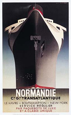
9. This image below is a monumental example of AM Cassandre's work because it's well-known because of Normady from the war and people associate advertising picking up around this time because they needed more people to sign up for war and combat.
Tuesday, April 1, 2008
Genesis of Twentieth Century Design
Pages 221-231
1. Describe Frank Lloyd Wright's work.
-This American architect's style was rectilinear approach to a spatial organization. He favored the philosophy of "organic architecture" with "the reality of the building"- in the interior spaces where people lived and worked.
-He defined organic design as having entity, "something in which the part is to the whole as the whole is to the part, and which all is devoted to purpose...It seeks completeness in idea in execution that is absolutely true to method, true to purpose, true to character."
-Wright saw space as the essence of design. His inspiration came from Japanese architecture and design for a model of harmonious proportion and visual poetry.
-His design interests were furniture, graphics, fabric, wallpapers, and stained-glass windows.
-He incorporated white or blank space as an element and he varied materials to unify as a whole.
2. Describe the work of the Glasgow school or "the Four".
-Charles Rennie Mackintosh, J. Herbert McNair, Margaret and Frances Macdonald= "the four"
-Unique style of lyrical originality and symbolic complexity and symbolic imagery and stylized form.
-Bold, simple lines define flat planes of color.
-Abstract interpretations of human figure.
-Geometric style of composition working with floral and curvilinear elements with strong rectilinear structure.
-Sisters had strong religious beliefs and symbolist and mystical ideas. Had a transcendental style, feminine, fairyland like, and a melancholy atmoshphere.
-Mackintosh contributions to architecture- design of chairs, objects, interiors as a total environment.
-Theme was vertical lines rising with subtle curves at ends.
-Tall, thin rectangular shapes and the counterpoint of right angles against ovals, ciricles, and arcs characterized work.
3. Describe the Vienna secessionist work.
-Love clean, simple, sans serif lettering, ranging from flat, blocky slabs to fluidly calligraphic forms.
-Movement was countermovement to floral art nouveau that occurred.
-Clash between tradition and new ideas from France, England, and Germany created conflict.
-Occurred April 3, 1897
-People included: Painter Gustav Klimit, architect Joseph Maria Olbrich, Josef Hoffmann, and artist-designer Koloman Moser were key members.
-Ver Sacrum (sacred spring): linear and geometric design elements
-Adolf Loos, Austrian architect famous article "Potemkin City" encouraging love of decoration and empty spaces. Organic meant use of human needs as standard for measuring form.
-style used squares, rectangles, circles in repetition and combination.
4. Name one thing Peter Berhens designed.
-"Celebration of Life and Art: A Consideration of the Theater as the Highest Symbol of a Culture". Used sans-serif type
Subscribe to:
Posts (Atom)