Sunday, March 30, 2008

Art Nouveau

Art Nouveau pages 190-220

1. Describe the style of this time and include typography. 
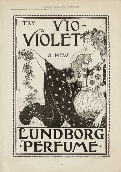
-The style of Art Nouveau was an international decorative style.  It included architecture, furniture, and product design, fashion, graphics, posters, packages, advertisements, houses, subway entrances, factories, and stairway cases, etc.  The visual quality is an organic plantlike line.  The woman figure was a form that was used often to adapt this fluid line.    

2. What was the impetus for this design movement?
-This Art Nouveau style came from the cultural collision between Asia and European countries.  The East and West changed as a result of this.  Asian art provided new approaches to space, color, drawing conventions, and subject matter that were unlike Western traditions. The term art nouveau came from a gallery in Paris run by dealer Samueal Bing.  

3. At least two designers who created important works in this style and their titles of their work.
1) Jules Cheret created poster for Orphee auz Enfers 1879 (style was more animated and greater unity of word and image) Second piece, "The Doe in the Wood", poster for La biche au bois 1866. Thirdly, poster "L'aureole du midi" 1893.

2) Eugene Grasset- created title page for Histoire des quatre fils Aymon, 1883.  (Dividing the space into zones, unified lettering, illustration, and decorative patterns into a total page design).  Second piece, exhibition poster 1894- Quietly demure instead of exuberant.

3) Henri de Toulouse-Lautrec- created poster, "La Goule au Moulin Rouge" 1891. (Shapes become symbols; in a combination signify a place and an event).  His second piece was a poster for Reine de joie in 1892.  Thirdly he made a poster for Aristide Bruant and Jane Avril in 1893.

4.. Example of Art Nouveau style

"The Peacock Skirt" by Aubrey Beardsley

Postcard (second website is where its from)


Victorian Era

1. Describe the specific styles of this era to help you identify it in the future, include the typographic style.
-The Victorian Era was a time period of strong moral and religious beliefs, proper social conventions, and optimism.  The main motto was, "God's in his heaven, all's right with the world". The people searched for a design spirit to express their epoch.  Gothic architecture, ornament, and letterforms were a heavy influence.  The design was sentimentalily, nostalgia, and a canon of idealized beauty were expressed through printed images of children, maidens, puppies, and flowers.  Traditional values of home, religion, and patriotism were symbolized.  Victorian typography's style is a traditional structure.  It was elaborate types with shadows, outlines, and embellishments were used and it was with a classical letter structure.  Towards the 2nd half of the era the type changed to a more metal-type that the basic letterforms were extreme designs.  Chromolithography was the influence for the Victorian type.  

2. What was the impetus for this design movement?
-Queen Victoria who reined over Great Britain and Ireland in 1837 was encouraging of this style.  Advertising became an influence to help get products sold that were being produced and to sell ideas to society. 

3. Example of Victorian House 
photo by Jim Wegryn 

Thursday, March 27, 2008

After Discussion Questions

After Discussion Questions:

1. The most useful thing that I learned was that the Industrial Revolution led to advertising.  Which is interesting because advertising is a huge part of our society today.

2. The only question I really have is how did the arts and crafts time start when there was sweat shops going on? It just seemed like there wasn't enough time for art because of the busy schedule of how American's began to change their values to hard working from other things.

3. Examples of arts and crafts


Moovie cow- Chicago Cow's- http://www.chicagotraveler.com/cowsonparade1.htm

This is art because it's all over Chicago and it's something that is around all of Chicago with different designs and its very creative, unique, and crafty! 


Tuesday, March 25, 2008

Arts and Craft Movement

Questions:

1. The style was a careful layout and typsetting, handmade paper, and intricate wood block illustrations.  Also, it was a design and printing movement advocating an asthetic concern for the design and production of beautiful books. It was an attempt to regain the design standards, high-quality materials, and careful workmanship of printing that existed before the Industrial Revolution.

2. The drive for this design movement was to bring back the detail into artwork.  It was to get the high quality standards back.

3. Arthur H. Mackmurdo who was a 26 year old architect. Two works by him are "The Century Guild Hobby Horse"- 1884 and title page for "Wren's City Churches"-1883.  Another one was his peacock design- 1883.
     William Morris who named his first typeface Golden and got his ideas from Jensen.  Two works by him are, "trademark for the Kemlscott Press"-1892 and "The Glittering Plain"-1894. (created a luminous range of contrasting values in this piece)

4. Examples:


Industrial Revolution chp.

Questions:

1. The Industrial Revolution started in England between 1760 and 1840.  It was a radical process of social and economic change rather than a mere historical period.  What was going on at the time was that human power were the primary sources of energy. Cities began to grow and people began to change  their out look on life.  Civilization was shifting from an interest in humanist values toward a preoccupation with material goods and that people were losing their ties with nature, aesthetic experience, and spiritual values.

2.  Robert Thorne created a fat-face typestyle is a roman face whose contrast and weight have been increased by expanding the thickness of the heavy strokes. The stroke width has a ratio of 1:2:5 or even 1:2 to the capital height. 
     William Caslon IV invented sans-serif type.  This font was decorative fonts in capitals and one line of medium-weight monoline serifless capitals,  It looked a lot like Egyptian face with serifs removed.  Currently close to today's 14 point.

3.  A wood type poster is a piece of wood that was basically imprinted in with different fonts, sizes, and styles.  It was durable light wood and cheaper than large metal types. 

4. The most important invention was the first steam-powered cylinder press created by Koenig.  It caused the speed of printing to skyrocket while the price dropped considerably.   It made things go quicker and easier for the printer! 

5. I don't have a scanner at home so they are in my sketch book! 

6. Joseph Niepce invented photography and he did it because he wanted to find another way to transfer drawings onto printing plates.   He wanted to make plates other than by drawing!

7. I found the photograph that was taken by F.T. Nadar, "Sarah Bernhardt" 1859.  It was of a famous actress who took Paris by surprise and became a major subject for the emerging French Poster.  I love this photograph because it looks very realistic and something about her face just shows beauty and how she is sitting or standing.  Her body language is telling us almost of her own story.  I just like how simple it is and how focused it is on the actual person rather than other things.


8. Waterfall